User Guide – Teamoty Scheduling
6. DASHBOARD, ANALYSIS AND BALANCE SHEETS
Several types of indicators and reports can be extracted from the schedule on Teamoty. They are always exportable to Excel or PDF.
![]() All indicators in the dashboard, balance sheets and analysis are related to the current version selected.
All indicators in the dashboard, balance sheets and analysis are related to the current version selected.
6.1. Buffer
- Before talking about indicators, we have to define the buffer, the project margin. In a geo-temporal planning, all the margins taken by each trade are condensed at the end of the project, leaving a gap of time between the last project task and the (fixed) key date.
- This is why in a geo-temporal planning, all tasks are considered critical, since none has any margin, and all can impact the planning. The margin will be materialized at the end of the project. Teamoty will calculate a number of days between these two elements by displaying the smallest value.
- Therefore, you must define one or more key dates as buffer in order to calculate and materialize this margin on the dashboard, by linking them to one or more tasks in your schedule.
6.1.1. Set a buffer
To set a buffer, go to Settings and then Key dates. Either you have already created the key date or you must define it (see Key dates):
- Go to the Buffer settings tab. It is necessary to define which tasks of which sequences are to be linked to this key date. For example below, the key date is related to Cleaning task on the STAIR Sequence .
- You need to define an hourly model (for Teamoty to calculate the number of buffer days in function).
- You can set an initial number of days in the “Value” field and indicate an alert threshold by entering a percentage of the initial number of days. This alert is used to determine if the pictogram will appear in green, orange or red on your dashboard.
If you do not have the value to fill in, you can calculate it by clicking on the 


- When the project opens, you come across the dashboard that allows you to have the overall indicators of the project.

- We see here, the progress of the project, so the rate of progress of the project is the percentage of the project that was noted. The Right First Time rate represents the number of tasks scored as completed on the first time (no leftovers).
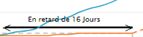
- The project’s status allows a view of the buffer defined according to certain key dates. The planning vision is the one defined with the “initial” planning and buffer, the projected version is defined according to the progress of the project (thus with the score done).
Teamoty automatically calculates the number of days remaining.
This projected vision is calculated based on the progress (score) made on the project as well as the registration and delays of certain tasks, delayed to the current date.
The color of the emoticon is based on the percentage of alert defined in the key dates.
- The progress report represents a vision of the status of all the tasks of the project with their statutes and the remains to be done. It is possible to export via Excel the list of these tasks completed, in progress, or late by clicking on Export,
 in order to have an exhaustive list of all these detailed tasks.
 - Task progress represents the status of the tasks based on the score completed (Right The First Time and RTBD), with the status of the RTBD (completed or to be realised).
- The S curve: the blue curve represents the evolution curve of the version defined as basic, the yellow curve represents the evolution curve of the current version. The full-line portion represents the tasks already marked, the dotted portion represents the projection of the tasks not marked with the registration on the current date.
Teamoty calculates a projected version automatically, by rescheduling the late tasks to the current date, in order to predict if the end of the project will be in time.
Moreover, to display the S curve on a key date, it is sufficient to complete the S curve box: ![]()
- The buffer history makes it possible to follow the evolution of the buffer as a function of time in order to follow the major evolutions impacting the buffer. In order to always have a margin you must stay in the green part of the buffer that evolves over time in a way.
This data is updated once a week; to track the use of the buffer more generally.
![]() The invitation of a supplier or subcontractor user to a project is done from the Dashboard in PROJET then right on
The invitation of a supplier or subcontractor user to a project is done from the Dashboard in PROJET then right on ![]() . Fill in the email of this user and then the profile to assign:
. Fill in the email of this user and then the profile to assign:
- Reading schedule: gives access only to reading schedule
- Lecture seule + pointage: donne accès à la vision du planning, sans modification possible avec la possibilité de pointer l’avancement
- Read-only + pre-score: gives access to the vision of the schedule, without modification possible with the possibility to pre-point progress via the mobile version, to be validated by a person «User» or «Read-only + score».
- Subcontractor: gives access to the vision of the schedule, and also the possibility to pre-point the progress of the tasks assigned to them, via the mobile version, to be validated by a person «User» or «Read only + score».
- User: gives all access to the project, including editing, editing and deletion.
6.2. Balance sheets
- In the Headers on Balance sheet tab, you can retrieve four types of project reviews: Actual, Resources, Materials and Progress.
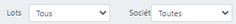
- For each balance sheet, you can filter on two filters, on the batch and/or on the company:
 .
. - It is possible to export the balance sheet by generating an image by clicking on
 or by exporting via Excel by clicking on
  .
.
6.2.1. Ressources
- For each project, it is possible to add different resources (in Settings) which are then assigned to one or more tasks.
- In this report, you will find the utilization curves of the different lifting means for the whole project:

- But it is also possible to filter by batch and/or company with , to display the usage time of each lifting means. The resulting graph can be exported as an image or an Excel file using the icons at the top right:
 .
.
6.2.2. Material
- For each task, several materials can be added. In this balance sheet, you will find the S curves and material consumption curve for all the materials entered globally for the entire project.
- You can also filter at the top by material, batch and/or company to display consumption:
- For example for the Joints material, you get the S curve and the material consumption over the project:

6.2.3. Progress
- For the Progress report, in the heading we find in the evolution of the tasks the same three graphs as on the dashboard.
- Then the possibility to filter by batch or company, then to choose according to:
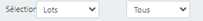 to be able to display the same progress charts but by batch or company.
 - You also have the possibility to filter by heading on zoning:

For example for the tile and faience trade:

We find the progress of the tasks according to the score, the S curve, the progress report (exportable in Excel), as well as the rate of the good of the first time as a function of time.
6.2.4. History of key dates
- This tab allows to have the history of key dates of the project. Teamoty keeps a history of the projected version every week.
For example for a key date FIN RDC displays in the dashboard an end trend on 22/03/2022:

6.3. workforce
6.3.1. Workforce follow-up
- On this screen, you will track headcount by actual day, batch or company. By default, you must see the TRADE table. If you want to change this tracking to COMPANIES, just go to RULES, then SETTINGS then actual tracking and choose COMPANIES.
- All you have to do is fill in each batch/company by day and then click on
 . This tracking can also be done on the mobile version, see Actual Workforce follow-up.
6.3.2. Workforce balance sheet
- The workforce balance sheet allows you to have in a global way or by lot or company the curve of the workforce through time, in header you will find the curve of workforce for the whole project for all the lots with the number of person daily for each.

- It is possible to disable some trades graphically by clicking on the captioned names.
- You have the possibility to filter by trade or company: to be able to extract this curve of workforce more accurately. All the obtained graphs can be exported as an image or an excel file in the icons at the top right: .
- This allows you to know if a subcontractor or trade is working continuously. This allows you to see the planning workforce, which you can manage.
6.4. Analysis
- In the Analysis tab, it is possible to generate an analysis of S-curve or workforce by also being able to filter on one or more specific trades, companies or areas:
Then click on the button ![]() .
.
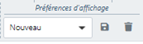
- Display preferences can be added by clicking:
- For the base curve, the Ordinate filter allows to extract curves with ordinate percentages (S-curve conventional), tasks or areas, allowing to choose the level of details in order to be able to follow the number of zones performed.
- This type of information can be interesting for example to follow completed rooms for the creation of a hotel or hospital.
- For each graph generated, Teamoty displays the difference (negative or positive) between the base curve (base version) and the current version curve:
- It is possible to zoom to have the detail of a part of the S curve. Simply select the desired period with a left click and maintain it over the entire period.
To cancel, simply click on: ![]() .
.
- As for balance sheets, it is possible to export the result in format or by exporting it via an Excel file .